I’ve been looking for a way to shoot straight monochrome JPGs that require no post-processing, so I’ve been exploring my Sony camera’s ability to create recipes.
This has partly been borne out by my Fujifilm XE-2, which produces great-looking black and white photographs, but this camera has poor low-light performance. I wanted to leverage Sony’s full-frame capabilities and see how well it handles low light.
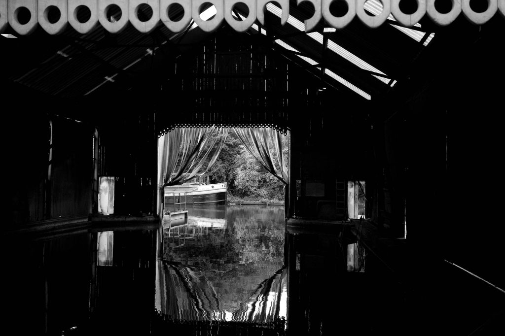
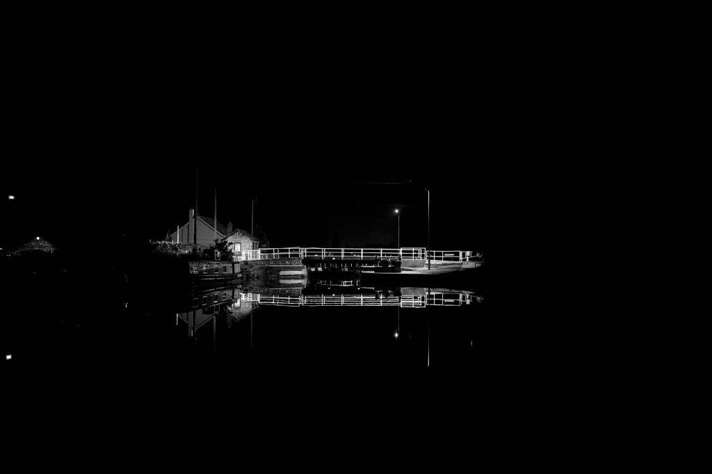
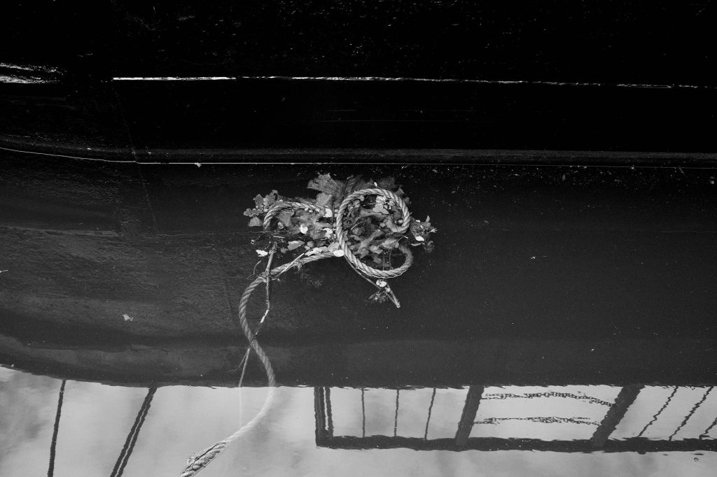
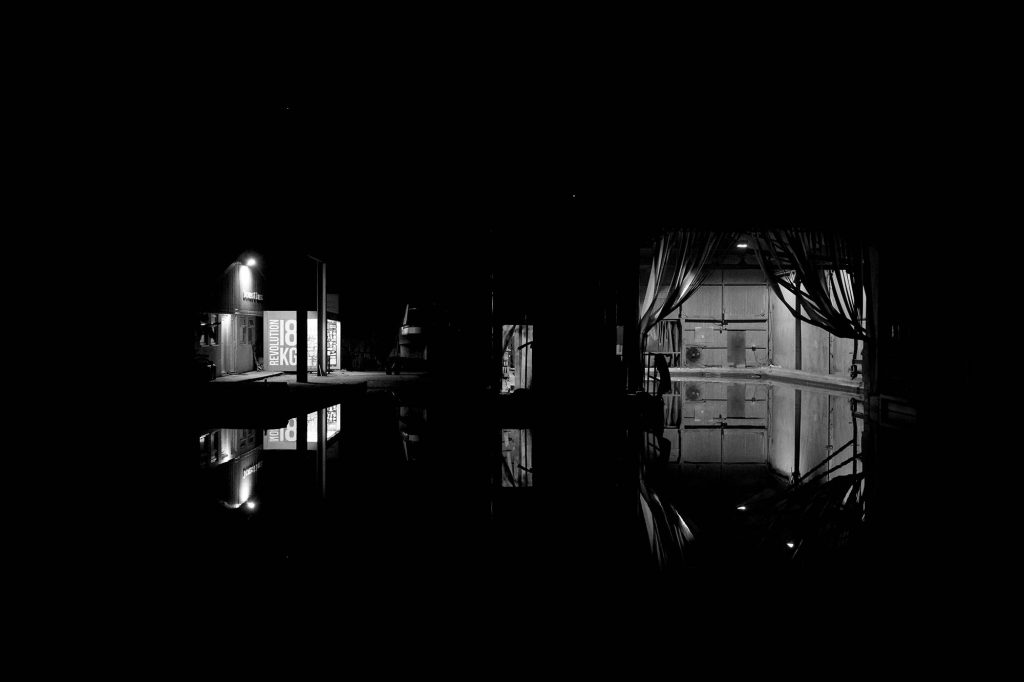
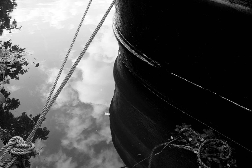
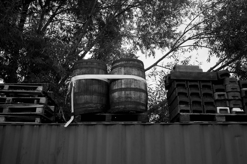
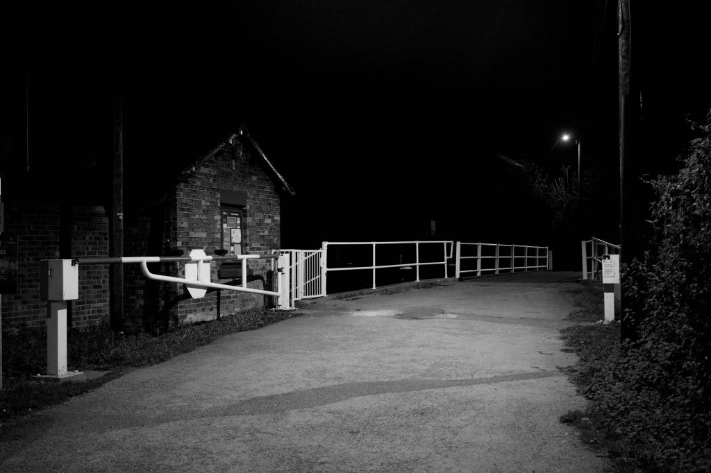
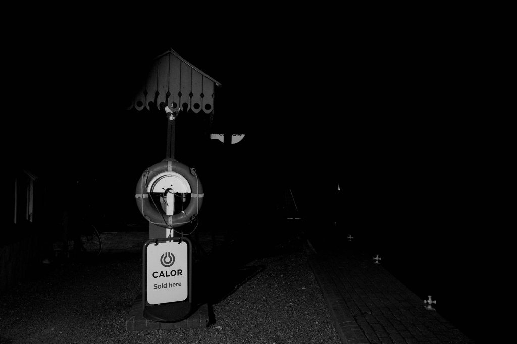
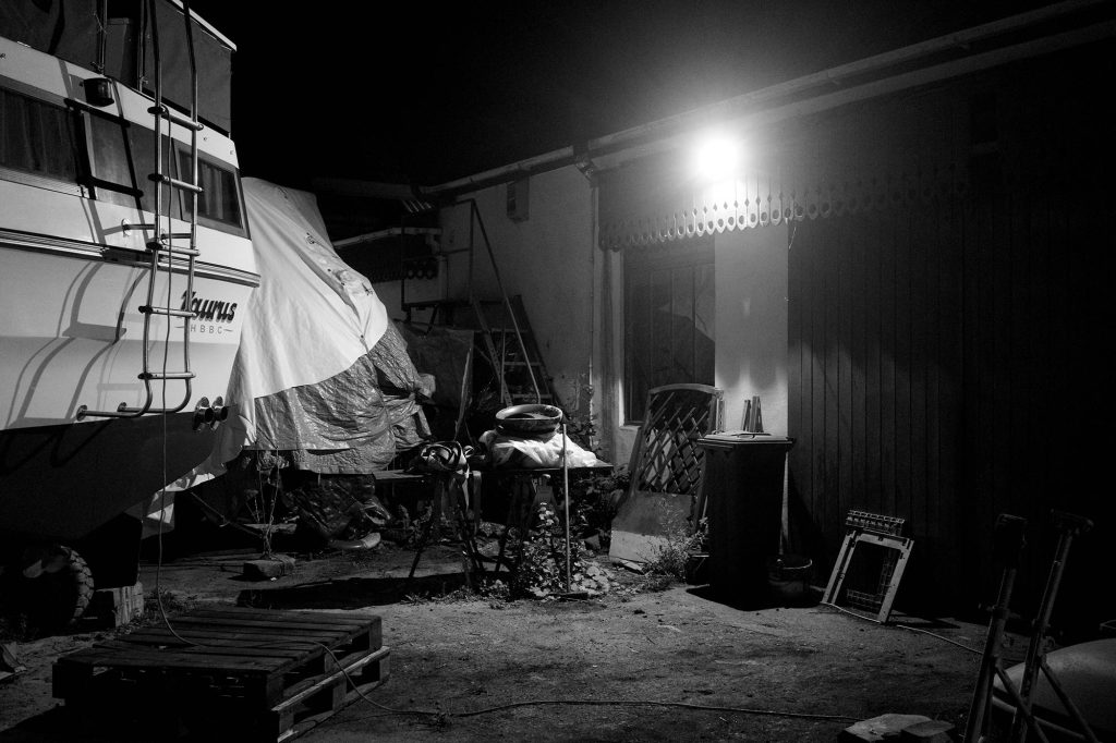
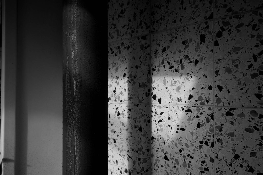
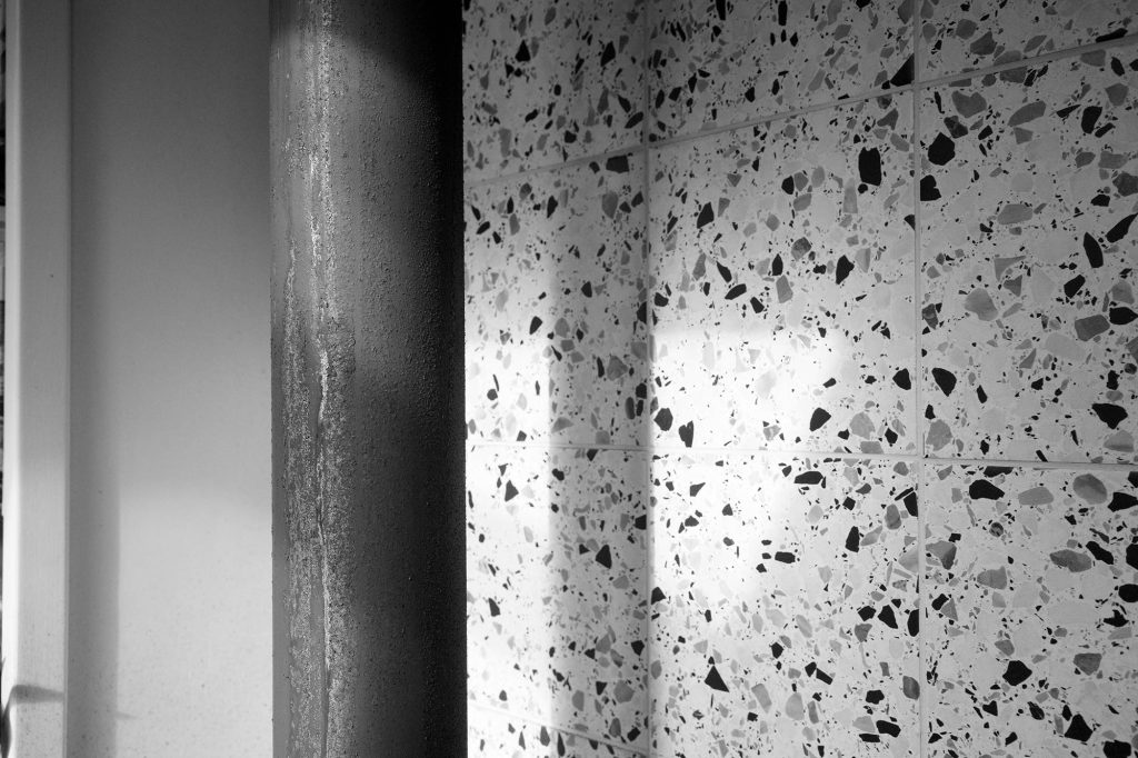
All photos are straight out the camera jpgs with no editing. You’ll notice I was pushing the ISO in both day-time and night photos to see how the digital noise rendered.
Sony Picture Profiles
Sony’s picture profiles are well-documented, but in most cases, they are primarily applied to video settings. There was even a long-held belief that picture profiles did not affect the raw image captured when taking a still photograph, until Gerald Undone conducted some research. That is beside the point, however, as what I wanted was a way to affect the JPEG captured in-camera, not the raw file.
Sony already has some creative presets for stills, but these are limited in customisation. What I wanted was a way to manipulate things like highlight roll-off, shadow density and so on. I wanted a greater understanding of what was going on under the hood, so I thought I’d look into it myself.
When you access the Picture Profiles on a Sony camera, you’ll see the following settings:
- Black Level
- Gamma
- Black Gamma
- Knee
- Color Mode
- Saturation
- Color Phase
- Color Depth
- Detail
What do they all mean, how do they affect the picture captured in-camera, and what do we need to change to make a high-contrast black and white recipe? I’m going to break each of these down in turn, starting with the technical explanation, followed by a simple explanation of what each does. I’ll conclude with my settings I’ve been using, examples of which you can see throughout this post. You can also read a breakdown, along with helpful graphs, on sony.net here.
Note: if you switch live-view on, you’ll instantly see the changes these settings make on your image as you work through them.
Building the Foundation: Tone and Contrast
Black Level
This setting, which ranges from -15 to +15, emphasizes or diminishes the black colour. Shifting it to the negative increases the blacks and smoothes out graduations, making dark areas crisper. Shifting into the positive decreases the blacks, moving them more into the grey.
For our high-contrast look, we want to crush the blacks for a deep, impactful feel.
My Recommended Setting: -15
Gamma
On Sony cameras, these are preset to different profiles like Cine1 and S-log, more usually associated with video. These profiles tend to flatten contrast and lighten darker areas to produce a “log” file that’s ideal for post-production colour grading. We want the opposite of that.
My Recommended Setting: Switch to Stills, which provides a good base contrast for a punchy photograph.
Black Gamma
This is the gamma curve which adjusts the gradations specifically in the dark areas of the image. Unlike Black Level, this makes more subtle adjustments to the luminance. “Wide” will produce more grey areas, while “Narrow” will keep the graduation range close to black. The Level setting then brightens or darkens this range.
My Recommended Setting: Set the Range to Narrow and the Level to -7 to deepen and compress the darkest shadow areas.
Mastering the Knee: Controlling Your Highlights
The Knee function is your secret weapon for managing the brightest parts of your image. In layperson’s terms, it prevents your highlights—like the bright sky or reflections on water—from turning into pure white blobs with no detail. This is often called “clipping.”
It works by compressing the brightest highlights, creating a smoother, more gentle “roll-off” into white. However, a “high-contrast” look demands the opposite. You want punchy, bright highlights that are crisp and well-defined, not soft and compressed. To achieve this, you can try turning the Knee’s effect off, or going extreme:
My Recommended Knee Setting: Set it to Manual Mode, with the Point at 105% and the Slope at +5.
Setting the Point to its maximum value tells the camera not to interfere until the highlights are close to blowing out. The +5 Slope is the steepest, most aggressive setting, which effectively creates a hard clip, preserving the maximum amount of contrast. Note, however, that there is a direct correlation between the Point and the picture profile you select. Some of the log profiles have a lower maximum Point value.
Pro Tip: Turn on your camera’s zebras (I set mine to 100+) while adjusting this. You’ll see exactly how the Knee setting gives you more or less room to play with in the highlights.
Getting the Tones Right: Colour Settings
This might seem counterintuitive for a black and white recipe, but the colour settings are crucial for eliminating unwanted tints and achieving a pure, neutral monochrome.
Colour Mode
This one is simple. To get a black and white image, you need to set the Colour Mode to B&W.
Saturation
Once you’ve set the Colour Mode to B&W, the Saturation setting becomes completely redundant. The B&W mode is a master switch that desaturates the image entirely, so this setting will have no effect. You can just ignore it.
Colour Phase
Here’s where it gets interesting. Have you ever noticed a subtle pink or magenta tint in the highlights of your in-camera black and whites? That’s because the sensor still captures the world in colour, and the underlying settings can leave a residual cast. It’s one reason why dedicated monochrome cameras, like the Pentax K-3 Mark III Monochrome that uses a monochrome sensor, are desirable. The Colour Phase setting is usually the culprit. A positive value shifts hues toward magenta, while a negative value shifts them toward green.
For a pure monochrome look, set the Colour Phase to 0. If you still see a stubborn pinkish tint, try setting it to -1 to actively cancel it out with a tiny push toward green.
Colour Depth
This setting adjusts the brightness (luminance) of individual colour channels. Just like with Colour Phase, these can sometimes have a subtle effect on the final black and white conversion. To be safe and ensure a perfectly neutral tone, go through all six colour channels (R, G, B, C, M, Y) and make sure they are all set to 0.
Dialling in the Sharpness: The Detail Settings
This is where the magic happens, but replicating film sharpness is also open to interpretation. A great high-contrast monochrome image isn’t just about shadows and highlights; it’s about texture and perceived sharpness. We want to emulate the fine grain and high acutance (edge sharpness) of film, not a blurry or overly digital image. To do this, we need to dive deep into the Detail menu.
First, set Adjust to Manual to unlock all the fine-tuning options.
| Setting | Recommended Value | Reason / Goal |
| Level | +5 | Adds a strong base of overall sharpness. |
| ↳ V/H Balance | 0 | Keeps sharpening balanced between vertical and horizontal lines for a natural look. |
| ↳ B/W Balance | Type 3 | Applies sharpening evenly to both the dark and light sides of an edge for maximum punch. |
| ↳ Limit | 4 | Prevents sharpening from creating ugly artifacts in low-contrast areas. |
| ↳ Crispening | +6 | Adds fine, thin lines to edges, mimicking the grain and texture of film. |
| ↳ Hi-Light Detail | +2 | Retains texture and detail in the brightest parts of the image. |
My Final High-Contrast Monochrome Recipe
After all that tweaking and testing, here is the complete recipe I’ve programmed into one of my Picture Profile slots. This gives me a fantastic, punchy, and sharp monochrome JPEG straight out of the camera, ready to use.
| Setting | My Recommended Value |
| Black Level | -15 |
| Gamma | Stills |
| Black Gamma | Range: Narrow, Level: -7 |
| Knee | Mode: Manual, Point: 105%, Slope: +5 |
| Color Mode | B&W |
| Saturation | N/A |
| Color Phase | -1 |
| Color Depth | All channels set to 0 |
| Detail | Manual (See detailed breakdown above) |
Notes
These are my current settings, but it’s only been 24 hours, so there is scope to adjust the settings further. One area I’m keen to explore some more is the sharpness level, currently set to +5. I need to do some side-by-side comparisons with the level dialled down.
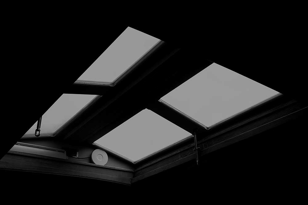
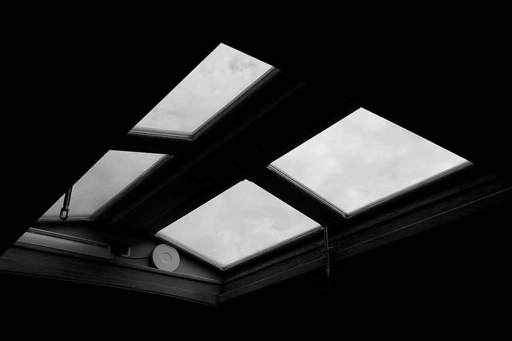
The few daytime shots in this post were taken when it was overcast. I’m hoping for greater contrast on bright, sunny days. As I write this, the sun has just come out, so here’s a little comparison shot of exposure adjustment:
One area I did not explore was white balance. I tend to keep my camera set to ‘daylight’, a hang-up when editing my raw files (I like to work from the same base). I do not know how white balance affects these settings when shooting jpg, so it’s something to explore further.
Feel free to use my recipe as a starting point, but don’t be afraid to experiment. Change one setting at a time and observe the results. And don’t be surprised if I revisit this topic with some fine-tuning!
I read it through 5 times. Now I get it. Thanks a lot !